Visualization perception on smartwatches
Perception des visualisations sur smartwatch
Résumé
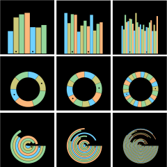
We present a perceptual study to assess how quickly people can perform a simple data comparison task for small-scale visualizations on a smartwatch. The main goal of this study is to extend our understanding of design constraints for smartwatch visualizations. We conducted a two-alternative forced choice experiment in which we assessed the lower bounds of task time for three common data representations on smartwatches (bar charts, donut charts, and radial bar charts) with three different data sizes for each representation (7, 12, and 24 data values) for a simple data comparison task. Through this experiment we found that participants were able to reach task time thresholds between ~160–245 ms across all data sizes for bar and donut charts, while the radial bar chart threshold was considerably higher at 1550 ms.
Domaines
Interface homme-machine [cs.HC]
Fichier principal
 Blascheck_2018_Perception des visualisations sur smartwatch.pdf (1.21 Mo)
Télécharger le fichier
 blascheck_2018_icon_visu.png (159.27 Ko)
Télécharger le fichier
| Origine | Fichiers produits par l'(les) auteur(s) |
|---|
| Format | Figure, Image |
|---|
Loading...